
Time 2 take a break?
Infographic design/Animation
Illustrations
As a group, we decided to go for a illustrative approach for the infographic poster to improve our illustration skills, as well as learn new skills along the way. most of our references in our moodboard was taken from Behance.
To make our poster more appealing to our target audience, we wanted to create a character that would be incorporated throughout the poster and therefore one of my group mates started developing a character sheet for this to start the process of being able to do so. The character sheet was used throughout the poster and animation as a guide. the character style was kept simple and limited to only one colour to avoid the poster to look too cluttered.
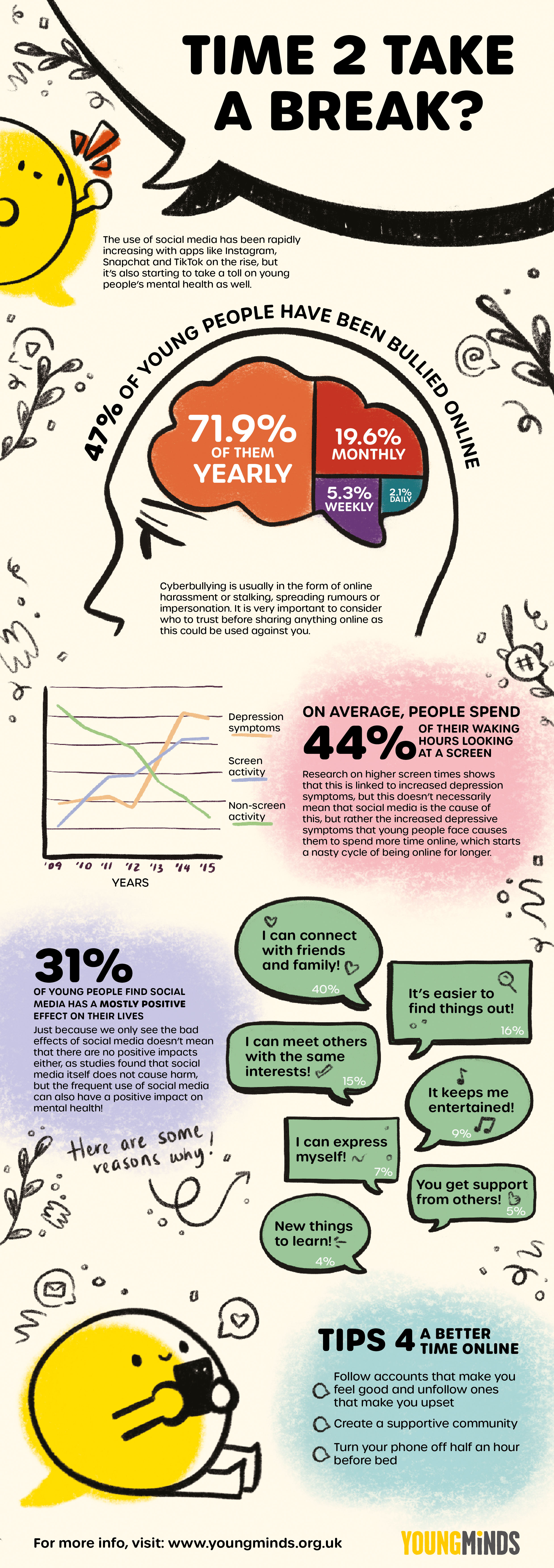
As part of a 2nd year group module, this project involved creating a poster and animation involving graphics to provide information about a certain topic, which in our case, was ‘social media and mental health’.
During this project, I took the role of gathering information about the selected topic, which would be used on the poster and helping with parts of the animation, as well as designing the poster.
More details about the project can be found in the workfile.


Illustration styles we were inspired by (illustration on the right by Serge Rodas)
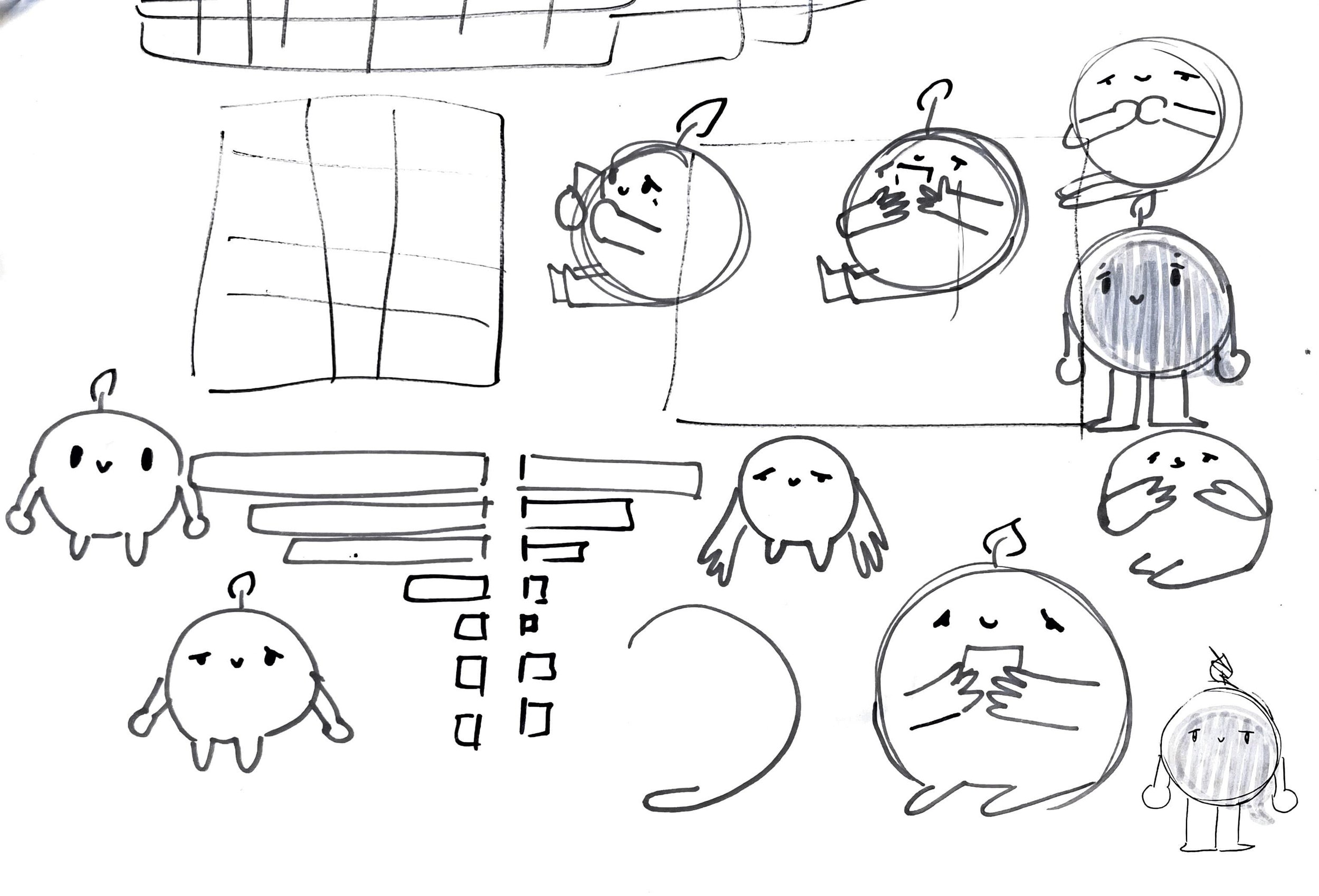
Initial character sheet created by my group mate
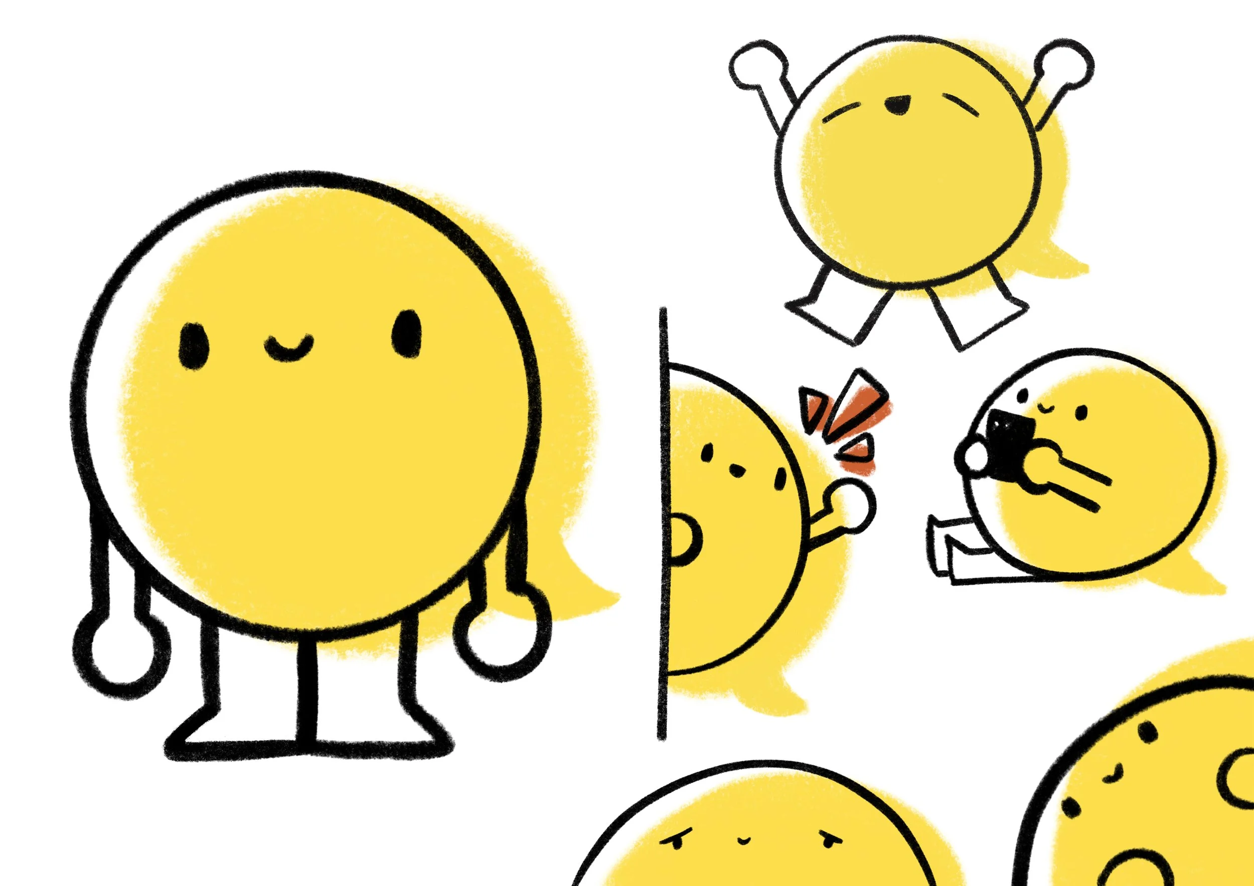
Final character sheet
Typography
In correlation to our chosen topic, we decided to use a sans serif typeface that was rounded and looked ‘gentle’. I took the responsibility of choosing the typeface and decided on ‘Urbane Rounded’. This typeface was chosen as it had the right amount of roundness to it and was versatile enough to be used in different weights and sizes without being too drastically different

Example of typography used in the poster
Layout
Based on our chosen topic, the aim was to create a layout that would include little doodles throughout the poster and use illustrations that would evoke a calming effect. Based on feedback given by tutors, we made adjustments to our sketches and added different data visualisations to show data and tried to design a clean layout that presented presented everything on the poster accurately.
The sketches were further developed by creating data visuals that would create a smooth journey throughout. The aim of our poster was not only to raise awareness of the negative impact of social media on mental health, but also show its positive sides as well. Therefore, our poster journey started off with a data visualisation showing the negative side of social media with a correlating data visualisation that showed the link to mental health and then finishing off showing the positive sides to social media as well, along with tips at the end to have a positive time online.
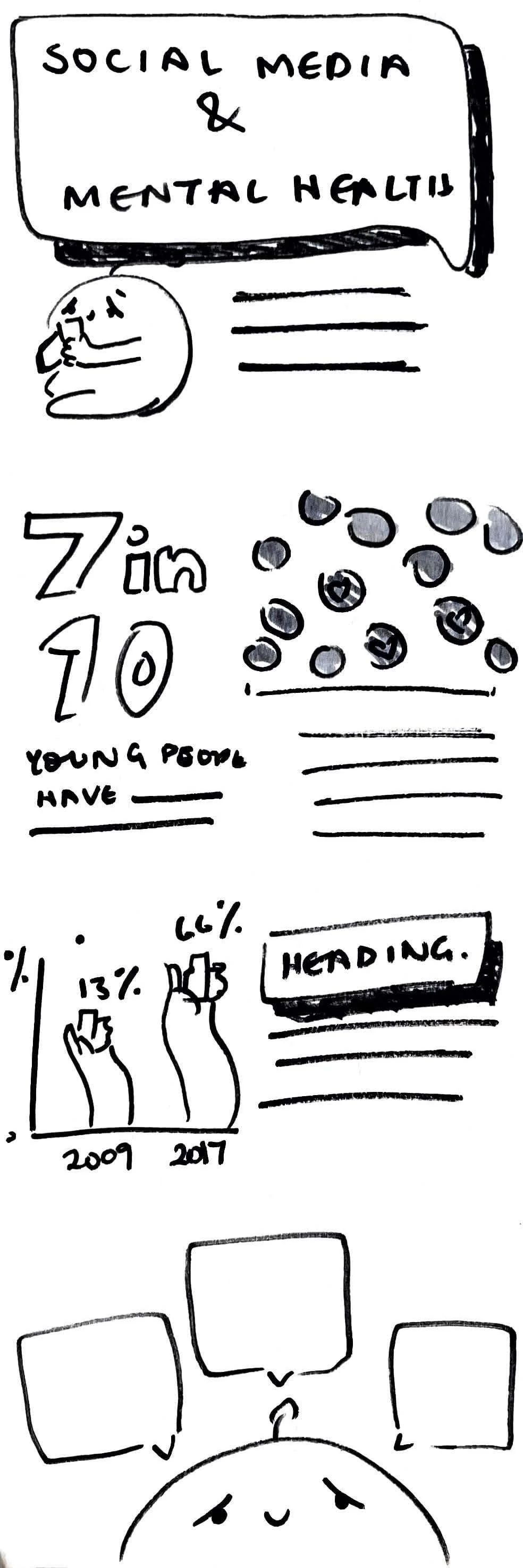
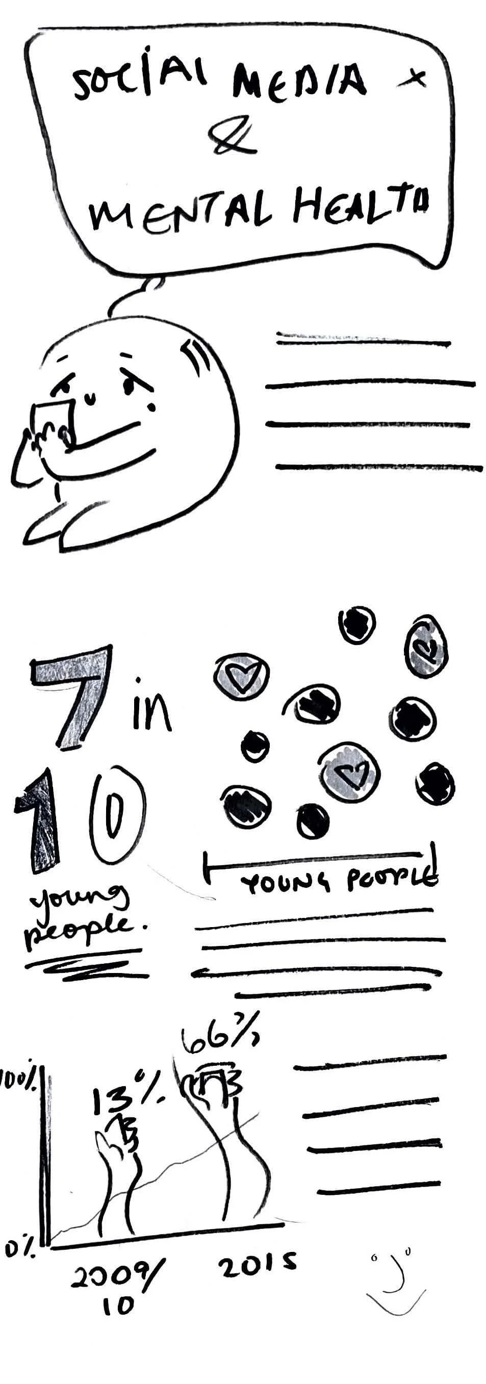

Initial sketches
Animation made as part of the project