From the Book to the Streets
This project was an introduction to editorial design during my first year of university. The brief was to produce a design for a new book about typography, with contributions from well-known academics in the field, titled ‘From the book to the streets. A selection of essays about typography from 1850 to 2020.’
The design was to be functional and appropriate for the supplied text. the design was not specified, but the end result needed to be fresh and contemporary.
Click here to view the PDF format of the book design.
Editorial design
Inspo sources
Most of the inspiration for designing this book was taken from looking at academic books at local bookshops. This helped with understanding how book layout differs based on the genre and how the use of white space plays a vital part in design.


Book layouts that were used as inspiration
Layout sketches
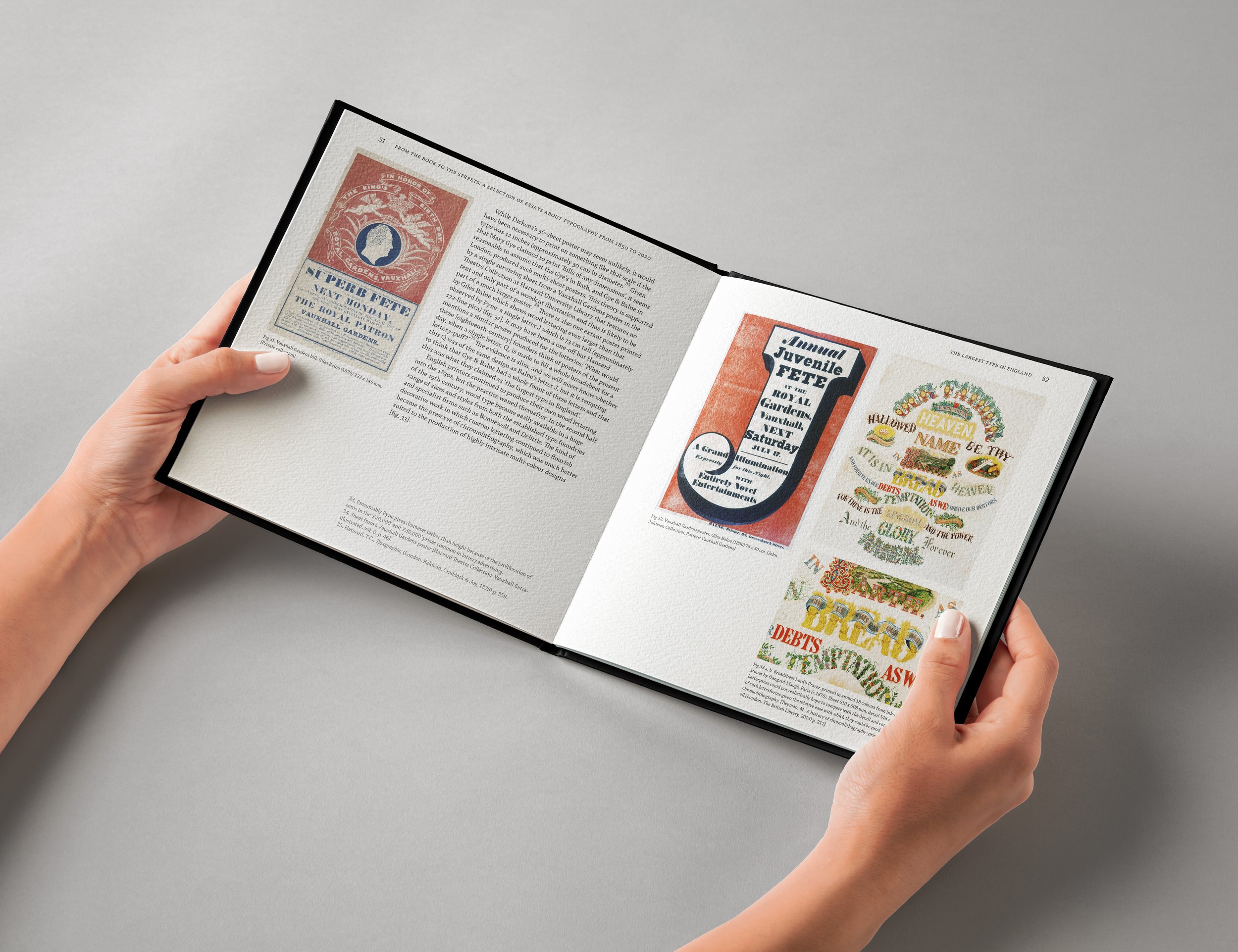
Based on existing academic book designs, I sketched out some layout ideas. These sketches were later drawn in scale both on paper and in InDesign to help with visualising the contents of the supplied text. A lot of the design choices when sketching these ideas was based on my reading of Notes on book design by Birdsall, in which i learnt that ‘the fewer horizontal lines the better’ as most books are ‘designed on a vertical screen’, therefore horizontal lines are more prominent to the designer rather than the reader. The book also mentioned that ‘the bottom margin should be manifestly larger than the top margin’ to ‘allow for running feet and page numbers’. However, in my own design, as I decided to use running headers and have page numbers at the top, I chose to use this logic the other way around, therefore my top margin was bigger than the bottom. Some of the digitalised layouts can be seen below:


Layout sketches


Layout sketches
Typeface choices
For the headings within the book, the typeface ‘Quasimoda’ was used, while ‘Chapparal Pro’ was used for the body and footnotes. these typefaces were mainly chosen to to their range of different weights in the font families. ‘Quasimoda’ specifically included bold weights that would appeal to the contemporary theme of the book. To contrast with the sans serif typeface, the slab serifs in ‘Chapparal Pro’ looked modern, which blended nicely with the sans serif typeface. Having read The elements of typographic style by Bringhurst, it also helped me choose these typefaces as they are fairly modern typefaces, thus relating well to the concept of the book as well as being printed well on paper.


Chosen typefaces
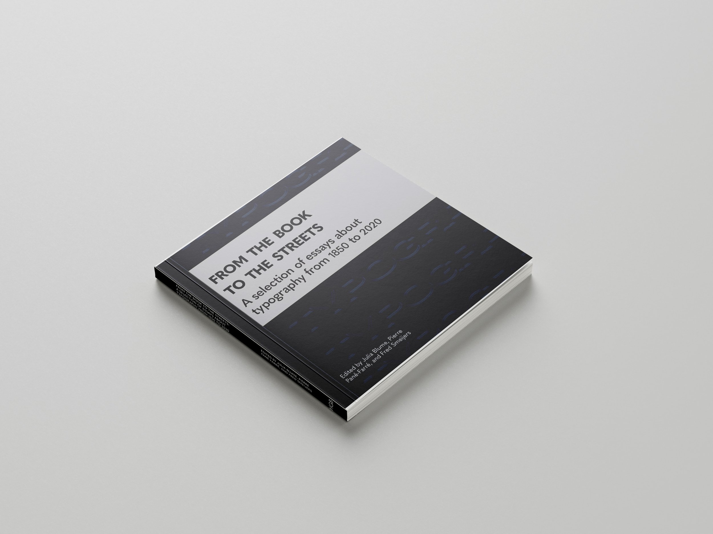
Book cover
The final book cover included the word ‘typography’ in repetition in the background, which would also be embossed with the book title. The book would be bound by a belly band in silver foiling, that would contain the title of the book.
For the paper stock of the book cover, I chose elements fire paper in 250gsm as the whiteness of the paper helped print the cover more brightly. To create the belly band, I used banner card paper which was 320×640 and was long enough to go around my book. For the foiling, I used adhesive foil sheets, which I had cut out the book title out of before sticking it onto the belly band.