Killer Queen
Film Poster
Poster design
This poster was designed for second year students of the Department of Film, Theatre and Television (FTT) at University of Reading. As part of their module FT2CSP, the students had to work in groups on short film projects. The projects could take the form of either short fiction, short documentary, or short live TV studio, with a duration of six minutes. As part of their project, they also needed a poster as the promotional material of their film. Out of the six different short films, the one I had chosen was ‘Killer Queen’. Alongside the poster, I had also created an animation for the title sequence of the film which was used in the film.
Having worked with students in this project was really fun as it was a very flexible and creative job. Being able to have the creative freedom within this job was very beneficial in keeping me engaged in the work. Getting to also see the behind the scenes of the film as well as the final cut of the film was very satisfying as it allowed me to understand the constraints and advantages of producing something in such a short period of time.
Check out the blog post containing further details about the project here.
About ‘Killer Queen’
‘Killer Queen’ is a queer murder mystery thriller, where the main two characters get invited to a house party. The two characters have romantic feelings towards each other and don’t realise this till they are at the party. Out of the blue, the host of the party gets murdered, and everyone is left to figure out the murderer.
Goals
The students’ goal was to receive a poster for promotional purposes. They wanted the poster to reflect the themes/genres highlighted in their film, which would then be used in social media and during the screening to promote their short film. Upon further discussion, the students’ had also requested a title sequence for the intro of their film, as well as recommendation for suitable typefaces. the title sequence was left to open interpretation.
Typography
To start off this project, I started off with making three lists of typefaces for the students to choose from: serifs, sans serif and decorative. One of the key points that the student mentioned when it came to typefaces was that it had to be open sourced, so that it is easily accessible, therefore, all the typefaces in the list were sourced from Google fonts and other websites such as DaFont. Another thing mentioned by the students was that they wanted the text to have the texture of dripping blood and due to this, all the decorative typefaces I sourced were reminiscent of the said effect.


List of typefaces that were provided to the students (the ones highlighted in green were approved)
Design Development
Having chosen the typeface, I started exploring possible solutions for the still title sequence. As the students wanted to incorporate the knife somewhere in the poster, I attempted to do so through the title sequence.
Having explored these options, I had also attempted at also animating the title sequence as part of the experiment (final results can be found below). I followed a tutorial on YouTube that greatly helped me with animating the title sequence to have the blood dripping effect. This was chosen as the final title sequence to be used in the intro of their film.
The final exploration was looking at combining image and type together. I tried replacing the letter ‘I’ in the word ‘killer’ with a knife to incorporate the knife motif on the poster. However, upon receiving feedback, the knife was changed into an illustration instead to match the weight of the typeface used. The typeface used was Abril Fatface, to match the typeface that was used in the animated title sequence for the film.


Experimentation with adding the knife to the title sequence

Final title sequence used in poster design
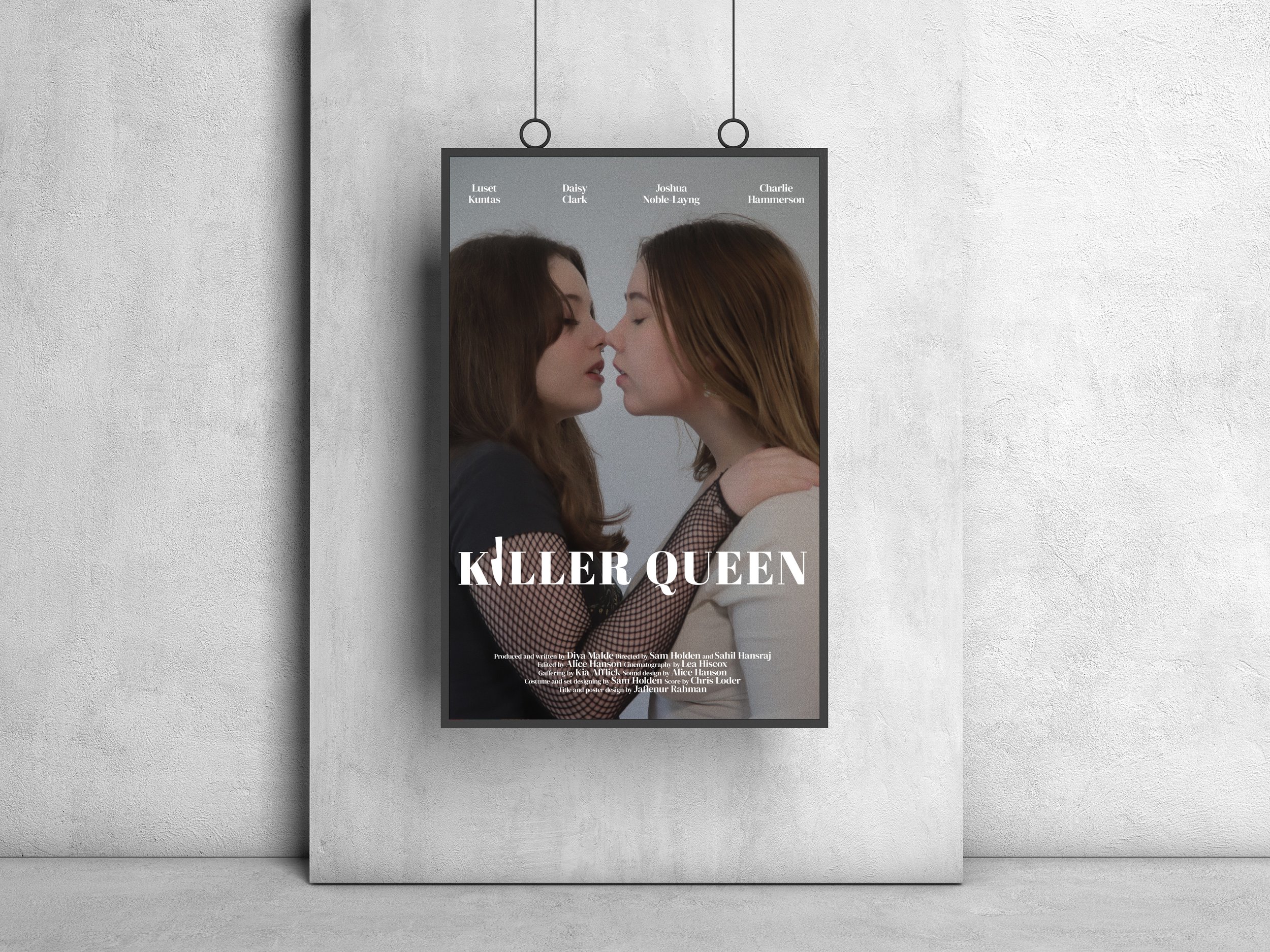
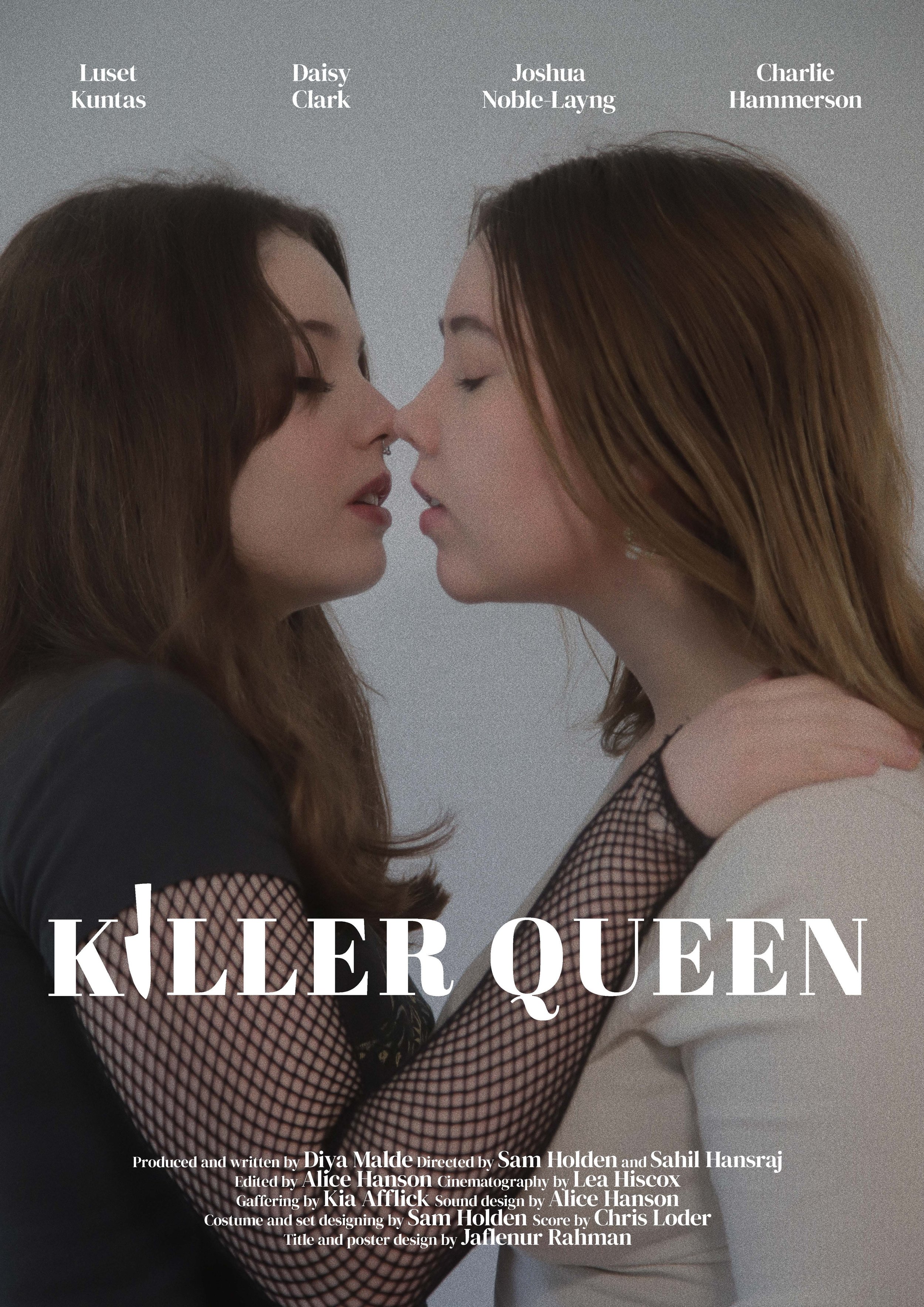
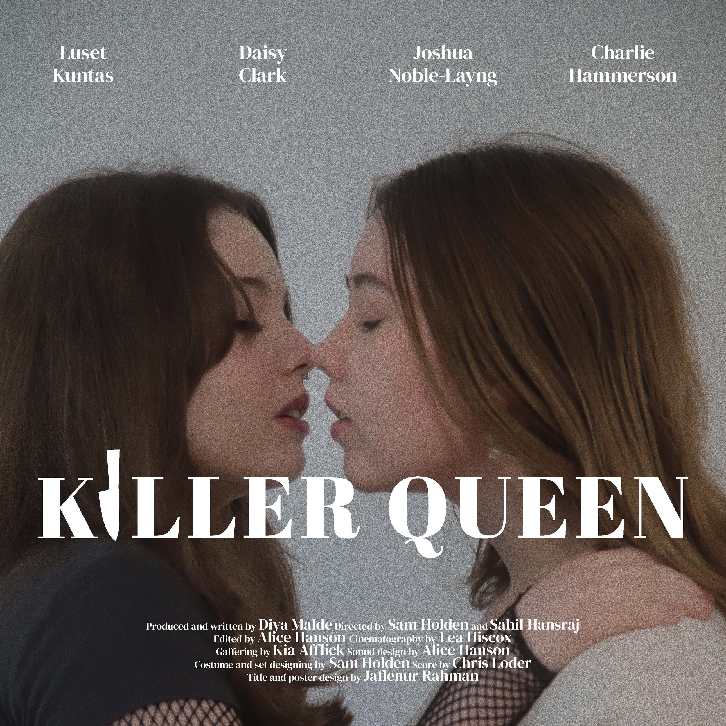
Poster
Having chosen the main image of the poster, I used Photoshop to edit the poster image. I created different versions of the poster, such as adding filters to darken the image and in a different version, used colour to block out the background to give emphasis to the main characters of the film on the poster. Another version involved cutting through the image to replicate the slashing effect of the knife slicing through the image. Despite all of these versions working well in sending the theme of the film, the final version chosen was the one with the edited photo with added filters.


Proposed ideas for the final poster design